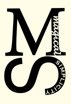
Today, Magical Simplicity got a logo. I hope you love it as much as I do!!
I obviously was trying to keep with the simple theme. The "S" is meant to look as much like a swirly underline as it is an "s."
I tried out several color schemes- but chose to keep it really simple. I tried several fonts and ultimately (surprisingly) chose four different ones. Each element means something different, so I thought they each deserved their own font. The "M" got a font with serifs, because it is so important. The "S" got sans serif because it has multiple functions. The "magical" is in cursive because, well because that makes it magic! And "simplicity" is in a very simple font.
So, hooray! It is featured currently on Facebook- Cheers to our newest addition!


